Intelligence dispatch / AZ-2026-9918
Safest Neighborhoods in New York City: Borough Crime Data
Trace official NYPD complaint records across all five boroughs, see where recorded volume gathers, and learn why the precinct and exact block still decide the case.

Verified safety brief
The direct answer
New York City never gives up a simple safest-neighborhood answer. A quiet block and a crowded station can sit inside the same borough, and raw complaint volume follows movement as much as residents. The map below opens the borough file. The precinct, route, and exact address finish the case.
- Data period
- Complete 2025 NYPD complaint records; optional 2026 view through June 30
- Geographic scope
- New York City, grouped into the five boroughs from official NYPD precinct records and precinct boundaries
- Last verified
Need one exact area? Open the New York City city file or enter a ZIP on the homepage.
City evidence / official records
New York City crime map
The city leaves a trail. Choose a report type, then click any borough to see where the record is thickest.
Every shape carries the selected report total. No color guessing required.
A deeper red marks higher volume—not a promise about what happens next.
The five boroughs contain hundreds of neighborhoods, precincts, transit hubs, and visitor corridors. They are evidence zones, not neighborhood verdicts.
Trace a report type
A listing can look calm at noon and feel different on the walk back from the train after dark. In New York City, a borough name is only the first clue. The street does the talking.
The short answer is clear: Staten Island reads safest in this file, followed by Queens, then Brooklyn, the Bronx, and Manhattan. But the borough order is only the outer frame. The safer call comes from the next layer down - the neighborhood, the precinct trend, and the few blocks around the address.
What stands out most is the split between broad rank and street reality. Riverdale-Spuyten Duyvil posts one of the city's lowest local complaint scores, even though the Bronx sits near the bottom in borough rank. Upper East Side–Carnegie Hill stays low too, even with Manhattan ranking last by borough average. That is the pattern to remember: a borough can look loud while one pocket stays quiet.
A few signals carry the most weight:
- Staten Island has the lowest borough complaint density in the file.
- Queens stays calmer in parts of the 111th, 112th, and 114th Precincts.
- Brooklyn Heights-Cobble Hill, Bay Ridge, and Park Slope-Gowanus sit well below the city baseline.
- Riverdale-Spuyten Duyvil is one of the city's lowest-scoring neighborhood pockets.
- Manhattan's high borough total is pushed by busy commercial and transit areas, not by the same level of shooting density seen in the Bronx.
The safest search path is narrow, not broad. Start with the borough to set the tone. Then move to the 300-meter walk around the address, the local precinct trend, and the nearest transit route. A calm side street can sit one turn away from a louder corridor.
One warning stays over the whole map: these figures reflect reported complaints, not every crime that happened. Low numbers can mean lower crime. They can also mean lower reporting. So the borough rank is a signal, not a final verdict.
If the choice is where to rent, stay, park, or walk home, the cleanest reading is simple: use borough rank to get oriented, then judge the exact block.
Top 10 Safest Neighborhoods in New York City
sbb-itb-6d427fc
1. Aden's ZIP

A citywide baseline sets the mood, but it does not tell the full street story. One address can sit in a calmer pocket while the next few blocks carry a different signal. That is where Aden's ZIP comes in.
The tool turns a borough-scale view into address-level context. It uses incident counts and population estimates to turn raw totals into per-resident risk scores across ZIP codes, neighborhoods, and precincts. The point is simple: cross-borough comparisons become more even, and a single address is easier to judge against the place around it.
Letter grades run from A to F. A specific address also gets a block-level breakdown.
Those grades are useful, but they are not final verdicts. They reflect reported complaints, not the full count of everything that happened. Streets with heavier patrols may log more complaints. Streets with lighter patrols may log fewer.
Start with the 300-meter score. That is the nearest field of view around the address. Compare it with the borough baseline, then check which crime types are pushing the score up or down. That closer read is the right lens for the borough sections that follow.
2. official local public-safety records
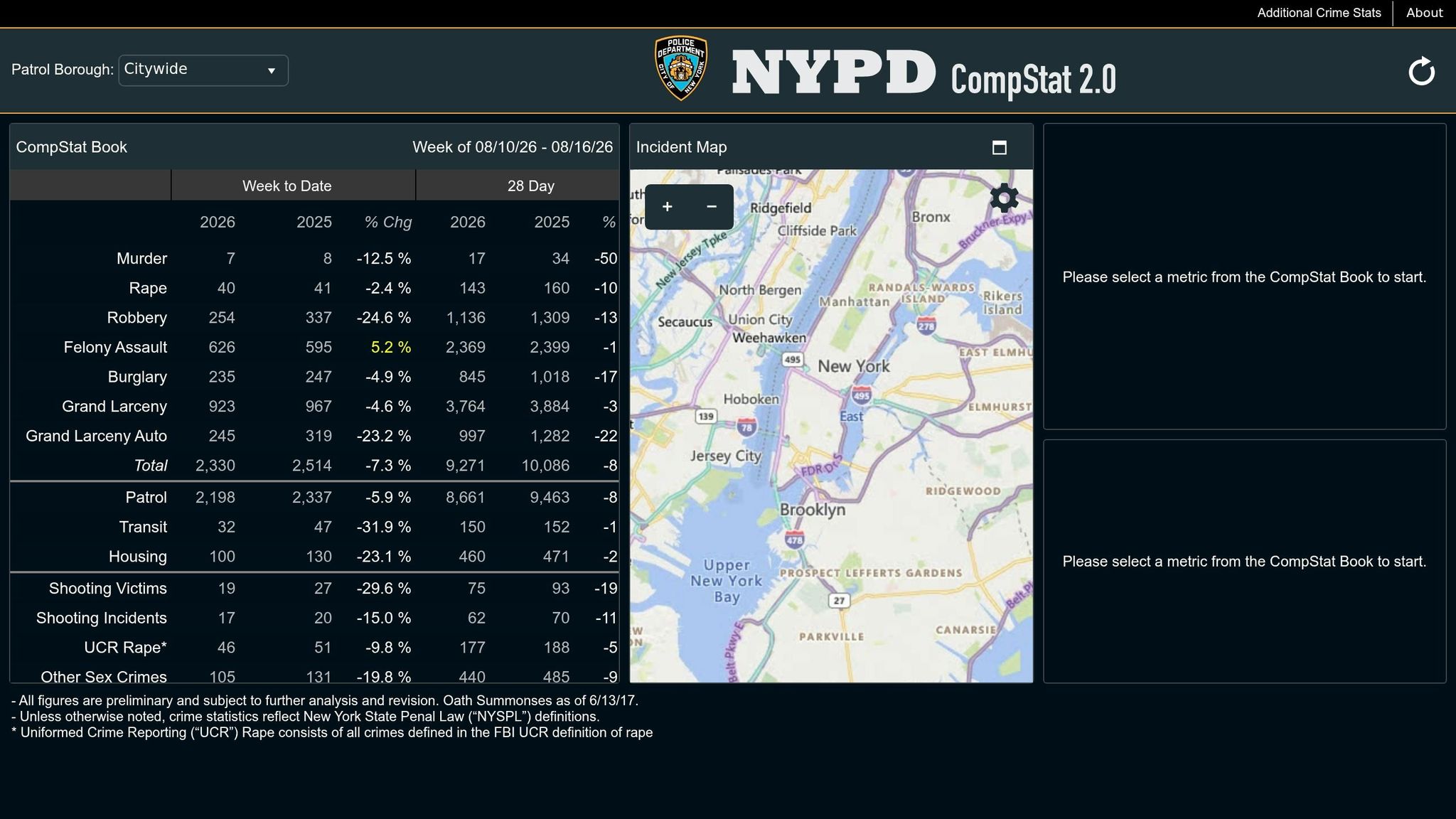
When ZIP-level scores blur the picture, precinct records bring the camera closer.
official local public-safety records is the city's weekly precinct crime dashboard. It shows patrol-borough and precinct records across all 76 precincts [1][2]. The file tracks the seven major felony categories, along with arrests, summonses, domestic-violence radio runs, and average response times [1][2].
The year-to-date view helps you line up the current year against prior years. That makes one thing plain: whether a precinct is moving up, cooling off, or holding its line [1].
Still, a precinct is a big piece of ground. One side of the map can feel quiet while another carries more police reports. That is why precinct totals work best as signals, not verdicts. Precinct lines rarely match the neighborhood names people use, so a low or high total does not tell the whole story for every block [1][3].
Use CompStat 2.0 to track 28-day and year-to-date movement. Then check those patterns against quarterly Crime Status Reports and incident-level records released through official local public-safety records [2][8].
With precinct movement on the board, the next layer is the citywide neighborhood file. For neighborhood and borough comparisons, the city's open-data and crime-map tools come next.
Sources: official local public-safety records portal [1]; NYPD Crime Status Reports (AC 14-150) [2]; NYPD Incident Level Data via official local public-safety records [2][8]. Precinct boundaries do not align with neighborhood or ZIP code boundaries; treat precinct averages as directional indicators, not block-level verdicts.
3. official local public-safety records Crime Datasets
CompStat 2.0 moves week by week. official local public-safety records opens the deeper file behind those summaries. For a close look at a neighborhood or ZIP code, this is the sharper tool.
The NYPD Complaint Data Historic dataset (qgea-i56i) is the main public record for incident-level complaint review. It reaches back to 2006. Each record includes the date, offense, borough, precinct, and coordinates, which lets the map drop down to the block and makes radius-based checks possible [3][8].
That detail matters once the view leaves the city skyline and drops to street level. The file can be filtered by Neighborhood Tabulation Area (NTA), borough, or precinct instead of leaning on citywide averages [3]. It can also be filtered by offense level and bureau. The result is a tighter borough-to-borough or neighborhood-to-neighborhood check than a citywide number can offer.
There is a tradeoff. Open Data updates quarterly or annually, so it trails CompStat's weekly feed [2][8]. Some records stay out for privacy, and only geocoded incidents show up on maps [2][8].
That means a quiet-looking map is not always the whole story.
Neighborhood averages can also bend the picture when a commercial strip or transit hub pulls in reports that have little to do with the nearby residential block [3]. Use CompStat to watch the weekly direction. Use Open Data to inspect the blocks underneath it.
Sources: NYPD Complaint Data Historic (qgea-i56i); NYPD incident-level data on official local public-safety records. Open Data records reflect crimes reported to police with valid geographic coordinates, and some incidents are excluded for anonymity. Neighborhood Tabulation Areas are Census-defined boundaries and do not match NYPD precinct lines.
4. NYC Crime Map
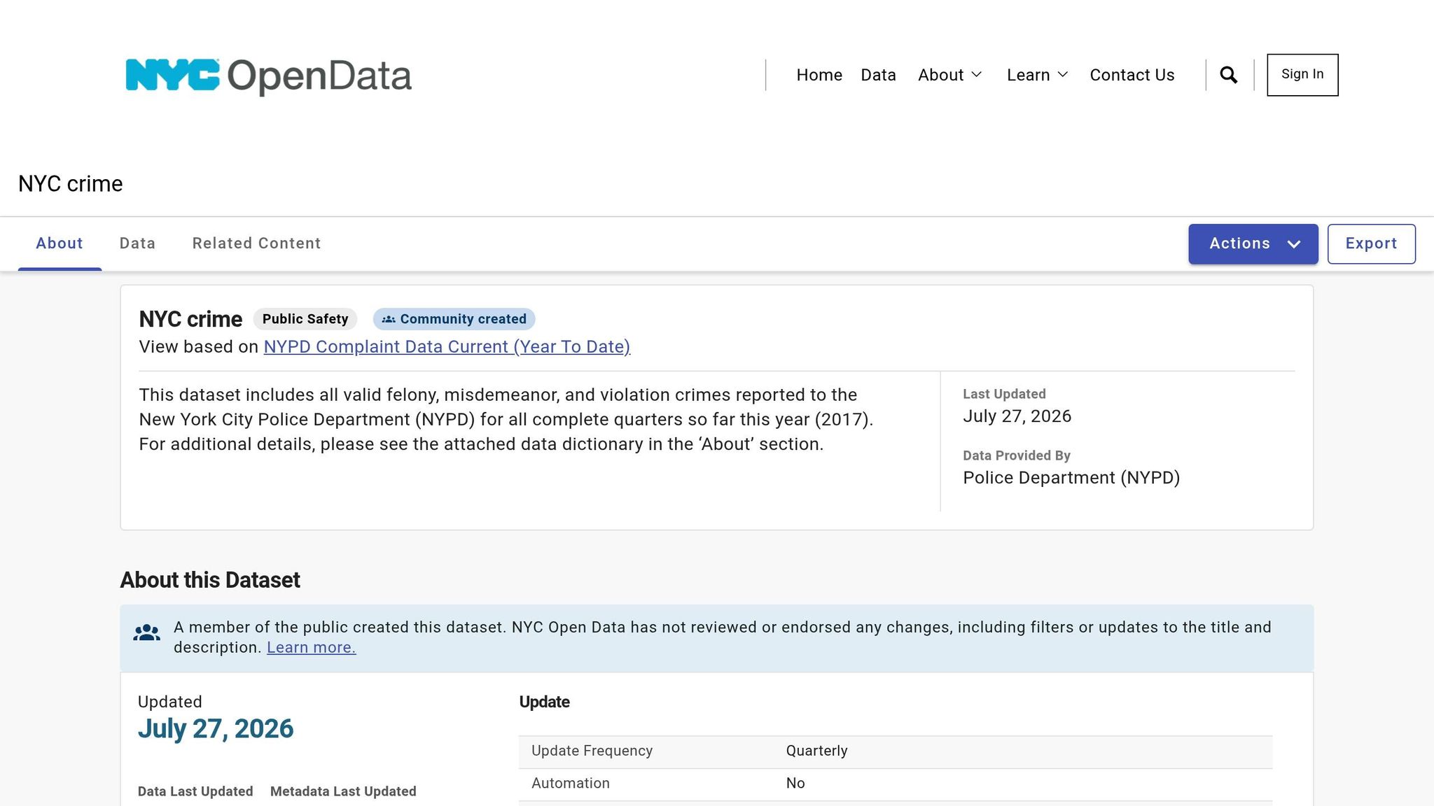
The NYC Crime Map turns NYPD complaint records into a street-level heat map. Warmer colors mean police recorded more incidents. Filter for robbery, felony assault, or grand larceny, and the view shifts from the whole city to one small patch of it. That makes this map the fastest check before borough averages start to blur the street.
Compared with borough or precinct summaries, the map works better when the question is narrow: this block, this corner, this station entrance [3][8]. A search can start with a street address, ZIP code, police precinct, or landmark. From there, the map lets the reader zoom in around one address and check nearby subway entrances, transit hubs, or blocks that look quiet inside a larger neighborhood average but stand out once the view drops to street level [7][3].
The map has blind spots. It trails weekly CompStat, shows only complaints that were geocoded, and cannot show incidents that were never reported.
Use it to check the exact block first. Then move to the borough-by-borough comparisons that follow, starting with Staten Island.
Sources: official local public-safety records; official local public-safety records NYPD Complaint Data Historic (qgea-i56i); NYC Crime Map (Safemap).
5. Staten Island
In the Jan. 1–Mar. 31, 2026 NYPD complaint file, Staten Island sits at the quiet end of the city map. It posts the lowest reported complaint density in New York City, at about 100 reported incidents per 300-meter walking radius. Queens comes in higher at 180, and Manhattan climbs to 280 [3].
The same pattern shows up in shootings. Staten Island records the city's lowest shooting density, with about 0.5 shootings per 500-meter radius [3].
That borough-wide number helps set the mood, but the calm is not spread evenly. The lower-risk pockets gather in a few residential sections, mostly on the South Shore.
The clearest cluster runs through Tottenville, Great Kills, Huguenot, and Annandale.
Staten Island is split across four NYPD precincts: 120th North Shore, 121st West Shore, 122nd Mid-Island, and 123rd South Shore. On the map, the South Shore and Mid-Island usually show lower recorded trouble than the North Shore and West Shore.
| Precinct | Region | Key Neighborhoods | Safety Profile |
|---|---|---|---|
| 120th | North Shore | St. George, Stapleton, New Brighton | Higher counts around the ferry and commercial corridors [7][9] |
| 121st | West Shore | Mariners Harbor, Port Richmond, Graniteville | Mixed residential, industrial, and commercial areas [9] |
| 122nd | Mid-Island | New Dorp, South Beach, Todt Hill, Midland Beach | Mid-island residential areas with moderate counts [9] |
| 123rd | South Shore | Tottenville, Great Kills, Huguenot, Annandale | Lowest counts; among the city's safest residential areas [7][9] |
For a quick street-level read, the 123rd Precinct is Staten Island's strongest safety signal. The 122nd follows behind it. The 120th and 121st read less favorably.
The pattern shifts again in Queens, where quiet blocks and busy ones sit much closer together.
Sources: official local public-safety records; official local public-safety records NYPD Complaint Data Historic (qgea-i56i); NYPD Precinct Community Councils (Precincts 120–123).
6. Queens
Queens does not move as one piece. Quiet residential sections sit near loud transit corridors, and the street can change fast from one pocket to the next.
Queens ranks as the second-safest borough in the file, with 180 reported incidents per 300-meter radius. That puts it above Staten Island, but below Brooklyn, the Bronx, and Manhattan [3]. With 2.4 million residents, raw totals can make danger look larger than it is unless the count is weighed against population and land area [4]. The borough average also covers sharp local swings. Briarwood (11435) logged 3,803 incidents, a reminder that one ZIP code can break from the borough mood fast [10].
The calmer pockets gather in North and central Queens, especially inside the 111th, 112th, and 114th Precincts.
| Precinct | Key Neighborhoods | Safety Signal |
|---|---|---|
| 111th | Bayside, Douglaston, Little Neck [9] | 11363 (Douglaston) and 11362 (Little Neck) both earned A safety grades [10] |
| 112th | Forest Hills, Rego Park [9] | Forest Hills has one of the city's lowest per-capita major-felony rates [3] |
| 114th | Astoria, parts of Long Island City [9] | Astoria ranks #13 citywide at 14 crimes per 300-meter radius [3] |
ZIP-level records point in the same direction. 11001 and 11363 both hold A grades [10].
Shootings tell a slightly different part of the story. Queens averages 1.5 shootings per 500-meter radius - a bit above Manhattan (1.0) and Brooklyn (1.4), but below the Bronx (3.0) [3]. That matters near subway stations, bus routes, and shopping strips, where borough averages can blur a harder edge.
For a Queens address, the safest move is simple:
- Check the precinct CompStat trend
- Check the nearest 300-meter radius or generate a location report for a specific address
- Check the walk to and from the subway
That last stretch matters. In Queens, the map can stay calm for several blocks, then tighten near a station entrance or busy corridor.
Brooklyn's pattern spreads out more and clusters less tightly, which makes the next comparison sharper.
Sources: official local public-safety records; official local public-safety records NYPD Complaint Data Historic (qgea-i56i); NYPD Precinct Community Councils (Precincts 111, 112, 114); official local public-safety records ZIP-level complaint records. Data period: January 1–March 31, 2026.
7. Brooklyn
Brooklyn changes fast.
A quiet row-house block can sit a few minutes from a loud commercial strip, and a boroughwide average can miss that turn. Like Queens, Brooklyn's risk can shift from one block to the next.
Brooklyn ranks third safest of the five boroughs, with an average of 224.5 reported incidents per 300-meter walking radius [3]. It also averages 1.4 shootings per 500-meter radius [3].
At the low end, Brooklyn Heights-Cobble Hill leads the borough with 7 reported incidents per 300-meter walking radius [3]. That sits far below the city average of 19.8 reported incidents per 300-meter walking radius [3]. Bay Ridge follows at 9, while Park Slope-Gowanus and Bensonhurst West each post 10 [3].
Use the borough average for background. Use the table for the street-level comparison that matters.
| Brooklyn Neighborhood | Reported incidents per 300-meter walking radius |
|---|---|
| Brooklyn Heights-Cobble Hill | 7 |
| Bay Ridge | 9 |
| Park Slope-Gowanus | 10 |
| Bensonhurst West | 10 |
| Carroll Gardens-Columbia St-Red Hook | 11 |
| Sheepshead Bay-Gerritsen Beach | 11 |
| DUMBO-Vinegar Hill-Downtown Brooklyn | 12 |
| Greenpoint | 12 |
| Prospect Heights | 13 |
| Fort Greene | 14 |
| Williamsburg | 18 |
| Canarsie | 18 |
Watch the corridors. Transit-heavy stretches and commercial streets can run hotter than the calmer blocks beside them [3][11]. The NYPD splits Brooklyn into Brooklyn South and Brooklyn North precincts.
Brooklyn's top neighborhoods sit well below the city average. Check the precinct CompStat trend and the blocks likely to matter most day to day, especially near transit stops or busy retail corridors.
The pattern shifts again in the Bronx, where borough averages climb and neighborhood gaps open wider.
Sources: official local public-safety records [1]; official local public-safety records complaint data [2]; NYC Crime Map [7][8]. Reported data only - incidents not reported to police are not reflected [8]. Borough and neighborhood figures represent density-adjusted walking-radius scores, not raw totals or per-capita rates [3][11].
8. Bronx
The Bronx carries the city's sharpest safety divide. In the northwest, Riverdale-Spuyten Duyvil stays quiet. Farther south, complaint volume and violence climb fast. On borough averages, the Bronx ranks fourth safest among the five boroughs, with 260 crimes per 300-meter walking radius. It also averages 3 shootings per 500-meter radius, the highest shooting rate in the city [3].
That borough number blurs the map.
In the Bronx, the split between neighborhoods matters more than the borough line. North and south do not read the same.
Riverdale-Spuyten Duyvil posts just 6 crimes per 300-meter walking radius - the lowest number recorded by any neighborhood in New York City [3]. The precinct picture points in the same direction. That area sits inside the 50th Precinct [1]. South Bronx precincts, including the 40th and 41st, record some of the city's heaviest violent-crime volume [7].
| Geography | Area Name | Crimes per 300m | Note |
|---|---|---|---|
| Neighborhood (NTA) | Riverdale-Spuyten Duyvil | 6 [3] | Safest in NYC; northwest Bronx |
| Precinct | 50th Precinct | Low complaint density [1][3] | Covers Riverdale area |
| Precinct | 40th & 41st Precincts | High complaint density [7] | South Bronx; higher violent-crime volume |
| Borough | Bronx (Overall) | 260 [3] | Ranked 4th of 5 boroughs |
South Bronx precinct totals are pushed up by dense business strips and heavy transit movement, so the street-level read matters. One busy corridor can change the tone of the numbers. That is why Riverdale and South Bronx blocks have to be judged on separate terms.
For any Bronx address, start with the 300-meter walking radius. Then check the local precinct CompStat trend and the NYC Crime Map before making a call on the block [1][8].
The pattern turns even sharper in Manhattan.
Sources: official local public-safety records [1]; NYC Crime Map [8]. Reported data only - incidents not reported to police are not reflected [8]. Borough and neighborhood figures represent density-adjusted walking-radius scores, not raw totals or per-capita rates [3].
9. Manhattan
Manhattan is the hardest borough to judge from one average.
On paper, it ranks last for safety among the five boroughs, with 280 crimes per 300-meter walking radius. That is the highest borough figure in the city, far above the 19.8 citywide baseline [3]. But Manhattan pulls in commuters, tourists, shoppers, and late-night crowds. Transit hubs and busy visitor corridors generate heavy complaint volume, and that swells the borough total without neatly matching the day-to-day risk faced by residents.
That does not mean Manhattan leads the city in violent crime.
Its shooting density stays low. At 1 shooting per 500-meter radius, Manhattan sits below the citywide average of 1.1 and far below the Bronx, which records 3 per 500 meters [3]. The file is clear on this point: high complaint volume does not automatically mean a higher violent-crime risk for people who live there.
The contrast inside the borough is sharp. Upper East Side–Carnegie Hill records only 8 crimes per 300-meter walking radius, making it the third safest neighborhood in New York City [3]. One part of Manhattan hums deep into the night. Another goes quiet a few blocks later.
| Geography | Area | Crimes per 300m | Note |
|---|---|---|---|
| Neighborhood (NTA) | Upper East Side–Carnegie Hill | 8 [3] | #3 safest in NYC |
| NYC Citywide Average | - | 19.8 [3] | Baseline for comparison |
| Borough | Manhattan (Overall) | 280 [3] | Ranked 5th of 5 boroughs |
Manhattan's 22 precincts are split between Patrol Borough Manhattan South and Patrol Borough Manhattan North. The 19th Precinct covers the Upper East Side. Midtown South and Midtown North cover the busiest commercial zones [1].
For any Manhattan address, start with the NTA walking-radius score. Then zoom in to the exact block and the nearest transit corridors on the crime map [3][8]. In Manhattan, one avenue can tell one story. The next one over can tell another.
That gap in scale sets up the next section, where borough, neighborhood, precinct, and ZIP figures are compared side by side.
Sources: official local public-safety records [1]; official local public-safety records [2]; NYC Crime Map [8]. Manhattan and neighborhood figures are density-adjusted walking-radius scores, not raw totals or per-capita rates [3].
Pros and Cons of Borough, Neighborhood, Precinct, and ZIP-Level Safety Data
The borough rankings help at a glance. But the right lens changes with the decision in front of you. Borough, neighborhood, precinct, and ZIP each show part of the street-level story. Each one also leaves something in shadow.
Borough figures work for a first sweep across the city, not for picking an apartment building. Staten Island at 100 crimes per 300-meter radius versus Manhattan at 280 gives a clear opening signal, but a calmer borough score can still hide blocks with serious crime [3].
Neighborhood data is the strongest lens for housing decisions. It tracks conditions close to where people walk and live. But there is a catch: a transit hub or busy commercial strip can pull the score up even if the nearby residential streets feel calmer at night [3]. If an NTA score looks hot, check what is feeding it.
Precinct data is the most current source used here, and that matters if you want the latest police record [1]. Still, precinct lines are police lines, not neighborhood names. One precinct number can blend very different streets into the same file - quiet side streets, busy avenues, nightlife strips, and transit edges [1].
ZIP codes are the fastest way to check an address. They are also the bluntest tool in this group. A ZIP can fold very different blocks into one label, which makes it the least exact safety lens here [5][6]. Use ZIPs to get bearings. Then switch to precinct or NTA data for the closer read.
The pattern is simple: start wide, then move tighter. Use the broad lens to get oriented. Use the narrow lens that fits the choice you need to make.
| Data Level | Best Use | Strength | Limitation |
|---|---|---|---|
| Borough | Compare overall city areas | High-level ranking across the five boroughs [3] | Too broad; hides dangerous corridors within safer areas [3] |
| Neighborhood (NTA) | Judge residential streets | Reflects walking-distance conditions [3] | Can be skewed by nearby transit hubs or commercial strips [3] |
| Precinct | Track official NYPD trend | Weekly updates via CompStat [1] | Boundaries do not match neighborhood names or ZIP codes [1] |
| ZIP Code | Check an address quickly | Easy to search by mailing address [5] | Not a police boundary; can combine quiet blocks with busier ones [5][6] |
One warning sits over all four layers. They show reported incidents only. If people do not report a crime, it is missing. If policing shifts from one area to another, the picture can shift too.
The next move is narrower: apply these filters to the exact borough, neighborhood, or ZIP under review.
Sources: official local public-safety records [1]; official local public-safety records [2]; NYC Crime Map [8]; U.S. Census Bureau NTA definitions [5]. All crime density figures are walking-radius scores, not raw totals or per-capita rates [3].
Conclusion
The first read is clear. In the Jan. 1–Mar. 31, 2026 NYPD complaint file, Staten Island ranks safest at 100 crimes per 300-meter walking radius. Queens follows at 180, then Brooklyn at 224.5, the Bronx at 260, and Manhattan at 280 [3].
But borough rank is only the first filter.
City averages can blur what happens after the next turn. Inside the fourth-ranked Bronx, Riverdale-Spuyten Duyvil records just 6 crimes per 300 meters. Inside last-ranked Manhattan, Upper East Side–Carnegie Hill records 8 [3]. The borough gives direction. The neighborhood shows where the pattern tightens block by block.
Use the search in this order:
- Start with borough rank to rule out the clear outliers.
- Move to the NTA score to spot neighborhoods that beat their borough.
- Check official local public-safety records for precinct trend [1][2].
- Open the NYC Crime Map to see hotspot clusters [8].
- Use Aden's ZIP to inspect the 300- to 400-meter walk around a specific address [3].
That path takes the reader from the city’s broad pattern to one exact address.
One caution stays on the file. All figures reflect reported incidents only. Low counts can mean low crime, or low reporting.
Sources: official local public-safety records [1]; official local public-safety records [2]; crime density figures (crimes per 300m walking radius) [3]. Data period: January 1–March 31, 2026. All figures reflect reported incidents only.
FAQs
How should I compare borough, neighborhood, precinct, and ZIP-level crime data?
Compare each file on the map it was built to fit.
Use NYPD borough crime statistics for borough-wide patterns. Use official neighborhood boundaries when the goal is a neighborhood-to-neighborhood check. Use NYPD precinct crime stats for precinct totals. Use NYPD incident data mapped to ZIP Codes when the comparison sits at the ZIP level.
Keep the comparison clean. Use the same time period and the same crime categories across every area. If one place is measured over a different stretch of time, or with a different set of offenses, the picture shifts and the street-level meaning starts to blur.
Why can a neighborhood feel safer than its borough ranking suggests?
A neighborhood can feel calmer than its borough ranking suggests. The borough file blends large areas into one score, but the street rarely behaves that neatly. One corridor can stay quiet after dark while a few blocks away the pattern changes.
Those rankings also track reported incidents. They do not measure private experience, near-misses, or trouble that never made it into the record. So a place may feel safe in daily life and still carry small pockets of risk, or a crime pattern that looks very different from the borough average.
What should I check around an NYC address besides the crime score?
Beyond any citywide crime score, go to the NYPD’s official weekly counts for the exact police precinct and borough tied to the address. That is where the record gets more precise.
Then open an NYC address or area map and track the pattern by date range and crime category. Focus on the mix of incident types, not just the total number on the screen. The current-year files for NYPD complaints, arrests, summonses, and shootings can show whether the local pattern leans toward theft, assault, vehicle trouble, or a thinner set of reports spread across different categories.